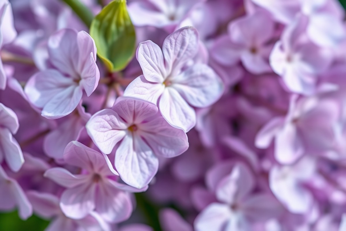
Is Lilac Purple? Clear Differences and How to Use Lilac Color
Is lilac purple? Yes, lilac fits within the purple family, but it’s lighter and softer.
Lilac is a pale purple with low saturation, making it look more delicate than standard purple. It usually carries a hint of pink or gray, which sets it apart.
Unlike deep purple, lilac feels airy and subtle. It’s a great choice when you want purple’s charm without its intensity. You’ll see lilac’s color code is #C8A2C8.
It shows a mix of red, green, and blue. This mix creates the soft lilac hue.
When working with lilac, start by comparing it directly to pure purple (#800080). This helps you see how much lighter and less vibrant lilac really is. Watch how nearby colors change lilac’s shade.
It can look more pink or blue. Lighting and use also affect its color.
Key Takeaways
- Lilac is a light, low-saturation shade of purple with pink or gray hints.
- The hex code #C8A2C8 represents a pale purple called lilac.
- Lilac differs from standard purple by being softer and less intense.
- Lilac’s RGB values mix red, green, and blue to create its pale tone.
- Compare lilac to deep purple (#800080) to understand their difference.
- Lighting can shift lilac’s appearance toward either pink or blue.
Is Lilac a Shade of Purple?
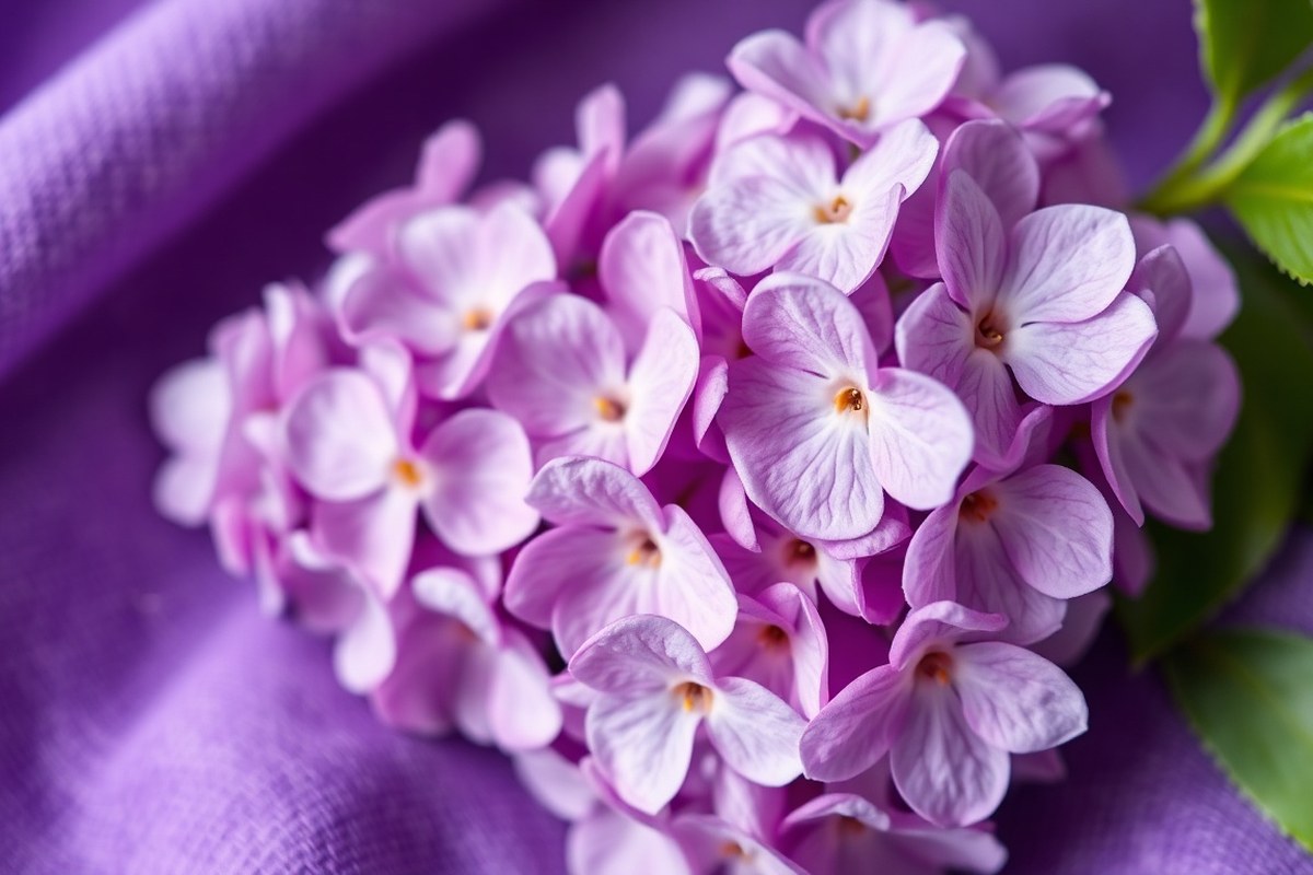
Lilac is a light purple color that includes a touch of pink. The name comes from the lilac flower, known for its soft violet petals mixed with pink. This pink undertone gives lilac a gentle, airy feel unlike typical purple.
The term purple covers a range of colors between blue and red. But lilac is a tint of purple, meaning it’s purple mixed with white to lighten it. This makes lilac much softer and less saturated than deeper purples like royal or violet.
Here’s a clear comparison to show how lilac fits within the purple family:
| Property | Lilac | Purple |
|---|---|---|
| Hex Code | #C8A2C8 | #800080 |
| RGB | 200, 162, 200 | 128, 0, 128 |
| Lightness & Saturation | Light, less saturated | Deep, highly saturated |
| Hue Family | Soft pink-gray undertone | Balanced red-blue |
| Visual Feel | Gentle, calm, and pastel | Strong, bold, and rich |
Lilac is part of the purple color group. It has the same hue but less saturation.
Lilac also includes more white, making it lighter. This makes lilac appear lighter and more delicate, while purple remains rich and deep.
To make lilac, use regular purple paint. Add white paint gradually to lighten the color.
Keep adding white until you get the soft lilac shade. You can add just a touch of pink to recreate that warm pinkish hint in lilac.
How Lilac Differs from Standard Purple
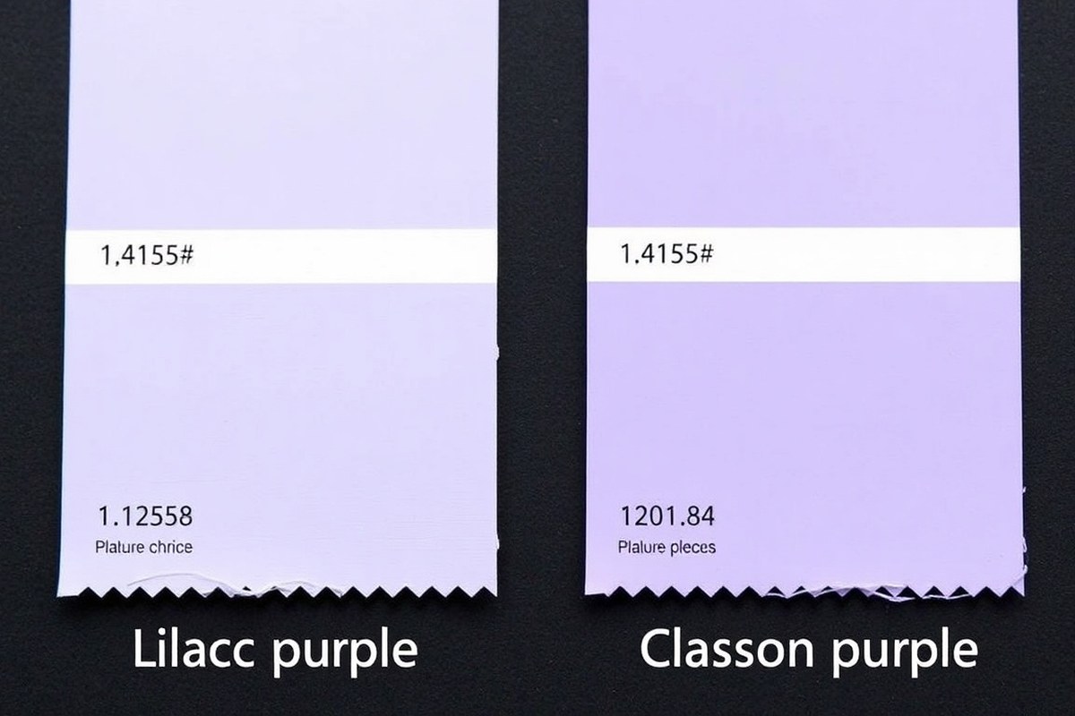
Lilac differs from standard purple mainly in hue, saturation, and brightness. Lilac has a lighter hue with lower saturation, which makes it softer and paler. Standard purple looks deeper and richer because it has higher saturation and lower brightness.
You can see the differences clearly by comparing their color codes. Standard purple uses the hex code #800080. This breaks down to RGB values of 128, 0, and 128.
Lilac has a hex code like #C8A2C8. Its RGB values are about 200, 162, 200. Lilac’s higher red and green percentages raise its brightness and drop its saturation.
This table compares some popular lilac shades with standard purple and related colors. It shows RGB and CMYK values along with their hex codes.
| Color | Hex | RGB | CMYK (%) |
|---|---|---|---|
| Standard Purple | #800080 | 128, 0, 128 | 0, 100, 0, 50 |
| Lilac | #C8A2C8 | 200, 162, 200 | 0, 19, 0, 22 |
| Bright Lilac | #DB91EF | 219, 145, 239 | 8, 39, 0, 6 |
| Deep Lilac | #9955BB | 153, 85, 187 | 18, 55, 0, 27 |
| French Lilac | #86608E | 134, 96, 142 | 6, 32, 0, 44 |
Looking at saturation, lilac shades usually have about 20% to 40% saturation in HSL values. Standard purple sits around 100%, which makes it intense.
Brightness for lilac is higher, ranging from 60% to 70%, making it lighter. Purple holds lower brightness, giving it a dense and deep look.
To pick a lilac color for your design, choose the hex or RGB codes that match the mood. For something gentle, go for softer lilac hues with higher brightness. For a richer look, pick deep lilac with darker tones but still softer than standard purple.
Don’t confuse lilac with lavender. Lilac has a higher blue and red mix, creating a slightly warmer, muted purple.
Common Variations and Shades of Lilac
Lilac comes in several popular shades, each with distinct undertones and moods. These range from bright and lively purples to more muted, dusty tones. Knowing the hex codes helps you pick exact colors for design or art projects.
Bright Lilac
Bright lilac pops with a clean, vibrant feel. It usually has a noticeable pink or blue tint, giving it energy without being too intense. The hex code #DAB6FC captures this bright tone well, blending light purple with a soft vibrancy.
This shade works great for accents or highlights in a palette. It draws attention but stays gentle enough for floral or spring-themed designs. Bright lilac pairs well with plain white or slate gray to keep things balanced and fresh.
Deep Lilac
Deep lilac offers a richer, more intense look than bright lilac. Its hex code #9955BB shows a darker purple with a slight pink cast. This shade leans toward a regal, lush vibe without slipping into full purple.
Use deep lilac for emphasis or to anchor a design palette. It brings weight and depth and pairs perfectly with pale lilac or muted grays. It’s ideal for invitations, fashion, or branding that wants a calm but strong personality.
French Lilac
French lilac is a classic shade, softer and a bit more muted than bright lilac. The hex #B497BD reflects a dusty purplish-pink tone with subtle gray undertones. This makes it versatile and elegant for both backgrounds and focal colors.
It’s perfect for creating calm, understated designs. French lilac blends naturally with creams, soft blues, and darker purples. It’s a favorite in textiles, cosmetics, and interior design for its timeless softness.
Dusty Lilac
Dusty lilac shifts towards gray with its hex code #A3989D. This shade feels vintage or muted because of its strong gray undertone. It’s less vivid and more restrained, often described as romantic and sophisticated.
Designers use dusty lilac where subtlety is needed without losing color impact. This tone works well as a background or main color in weddings and classic fashion. It matches slate gray, fine neutrals, and silver metals well.
- Pale Lilac: Very light, with a soft pink undertone
- Bright Lilac: Lively, pink-blue tint, hex #DAB6FC
- Rich Lilac: Balanced purple-pink, deeper than bright lilac
- French Lilac: Muted pink-purple with gray undertones, hex #B497BD
- Dusty Lilac: Gray-leaning, vintage feel, hex #A3989D
- Lilac Luster: Subtle shimmer, soft pink-purple without harshness
- Deep Lilac: Dark and intense purple with pink tint, hex #9955BB
Lilac Luster
Lilac luster is less about color and more about finish. It combines soft lilac shades with a gentle shimmer or satin effect. This makes it pop softly under light without overwhelming the eye.
It suits products like makeup, fabrics, and digital designs needing a delicate glow. The undertone is usually pinkish-purple, leaning towards a warmer shade of lilac. Try it in small doses to add elegance and interest.
Lilac’s Origin, History, and Cultural Meaning
The color name “lilac” first appeared in English around 1775, drawing from the flower’s delicate shade. Lilac means innocence, youth, and early love in culture. It feels softer than purple’s strong authority.
Purple’s history starts in 975 AD. It shapes how people see lilac and similar colors.
When Lilac Became a Named Color
The word “lilac” was first linked to the flower in 1766, not the color itself. In 1775, people began using “lilac” to describe the unique color inspired by these flowers.
Lilac as a name came after purple. Purple’s history goes back to 975 AD.
This timeline shows how lilac moved from just a flower name to a recognized color. Understanding when lilac entered the color lexicon helps explain its softer cultural impact compared to purple.
Cultural Symbolism of Lilac
Lilac symbolizes sweetness, innocence, youth, and the feelings of first love. Lilac shows early love and purity.
It comes from the flower’s soft, calming shade. People often use lilac for designs that need softness or a supportive background mood.
This symbolism contrasts with purple’s strong ties to power and authority. Lilac works best in settings needing subtlety instead of commanding attention.
How Purple’s History Influenced Lilac’s Meaning
Purple was linked to royalty long ago. It was rare and costly in old times.
This long-standing idea gave purple a heavy, commanding meaning in culture. Lilac, being a lighter and less intense hue, grew to represent gentler emotions.
Lilac’s name comes from Persian, meaning “bluish” or “indigo.” It ties to blue tones.
Because of blue, lilac feels calm, not powerful. This differs from purple’s cultural meaning.
Summary of Lilac’s Symbolism Compared to Purple
Lilac stands for youth, innocence, and soft emotion, stemming from the flower’s natural color. Purple symbolizes authority, luxury, and seriousness because of its history. This difference makes lilac a subtle alternative to purple in design and art.
Knowing this helps you decide when to choose lilac for calm feelings over purple’s boldness. It’s a color with a peaceful, supportive vibe rather than making a strong statement.
Is Lilac More Pink, Blue, or Purple?
Lilac is a light purple that leans slightly pink rather than blue. It sits on the color wheel between purple and pink, making it warmer than lavender. Lavender tilts more toward blue, giving it a cooler, bluer cast.
To spot the difference between lilac and lavender, look for a pinkish haze in lilac tones. Check if the color contains warm reddish undertones; that points to lilac. Lavender shows more cool blue hints, lacking the soft pink glow lilac carries.
Lilac looks softer than standard purple. It has more white mixed in. It also includes a bit of gray.
This mutes the color, cutting down on brightness and saturation. Lilac has a subtle pink tint that adds warmth.
This tint makes lilac feel gentle. It seems near-neutral, not intense or icy.
Note that what you call lilac can shift depending on lighting and screen settings. Always check colors side by side to see pink or blue undertones clearly.
On a color wheel, lilac hovers closer to the pink area near purple. Lavender moves toward the blue side.
This shifts how the colors feel in design or art. Use lilac for warmth and softness and lavender when you want a cooler look.
Best Colors to Pair with Lilac
Lilac pairs well with colors that improve its soft, calming vibe. Pale blues and pinks highlight lilac’s gentle tone without overpowering it.
Whites or creams keep the palette light and fresh. Silver adds a touch of sparkle and elegance.
Combining lilac with deeper purples works beautifully. Purple acts as an anchor, giving depth to lilac’s pale shade. Use purple as an accent or background to create a sophisticated look.
Lilac sits between purple and blue family colors. This makes it ideal for smooth designs. It helps create harmony with these tones.
- Pale blues complement lilac’s cool undertone
- Soft pinks create a romantic, gentle feel
- Whites and creams keep the space or outfit bright
- Silver adds subtle shine without clashing
- Deeper purples balance lilac for richness
Bright oranges, burgundies, and forest greens usually clash with lilac. These strong, warm tones overpower lilac’s softness.
Avoid them if you want a clean, balanced look. Using such colors together can make the design feel chaotic and uncoordinated.
Using lilac and purple together works when you keep lilac as the main, soft field. Let purple play a smaller role as a bold accent or anchor.
This combination brings out lilac’s unique charm while adding visual weight. Avoid mixing them at equal intensity to prevent competition between the shades.
How to Mix and Create the Lilac Color
You can create lilac easily with paint or digital colors. It’s basically a soft purple made by mixing red and blue paint with white added. For digital use, lilac matches specific RGB, HEX, and CMYK codes that design programs accept.
Mixing Lilac in Paint
Start with red and blue paint to get a basic purple. Adding white paint lightens it to lilac’s soft, pale tone. You can adjust the mix slightly to warm it up or cool it down.
Follow these steps to mix paint lilac:
- Squeeze equal parts of red and blue paint onto your palette.
- Stir the paints together until you get a balanced purple color.
- Add small amounts of white paint gradually to lighten the purple.
- Mix thoroughly to avoid streaks and get an even lilac shade.
- Add more red to get a pinkish lilac shade. Use more blue for a cooler tone. Adjust slowly until you reach the color you want.
- Test a small amount on paper before mixing a large batch.
Mixing takes some trial and error as different paints have varied strengths. Too much white can dull the color. Use quality paints for the best richness and even blending.
Creating Lilac Digitally
Design software uses color codes to produce lilac precisely. The common HEX code for lilac is #c8a2c8.
Its RGB values are red 200, green 162, and blue 200. For print in CMYK, use 0% cyan, 19% magenta, 0% yellow, and 22% black.
To get lilac on your screen:
- Enter the HEX code #c8a2c8 in your software’s color picker. Or use RGB values (200, 162, 200). Both will give you the same color.
- Choose the CMYK percentages (0, 19, 0, 22) when setting colors for printing.
- Adjust brightness or saturation to fit your design mood.
Make sure your device’s color calibration is accurate for true lilac shades. Previewing on different screens helps avoid unexpected shifts in tone.
Adjusting Lilac Shades and Tints
Make lilac lighter by adding white paint or increasing brightness digitally. This creates tints, perfect for soft backgrounds or highlights. The hex codes fade from #cdabcd to #e9d9e9 as white adds more lightness.
To darken lilac, mix in black paint gradually. This forms shades used for shadows or depth.
Darker lilac shades have HEX codes like #b491b4 and #504050. Too much black can muddy the color, so add it slowly.
In digital tools, decrease brightness or add black to the CMYK mix carefully. Using these options lets you control lilac’s tone without changing its base hue. Experiment with small changes for the best results.
Psychological Effects and Design Uses of Lilac
Lilac often evokes feelings of calm, nostalgia, and inner peace. It can help reduce stress and encourage relaxation. At the same time, it may appear lazy or boring if overused without contrast.
Designers use lilac differently than purple because it feels softer and less intense. Purple signals power and royalty, making it good for bold statements. Lilac works better for fresh, soothing rooms or gentle fashion pieces.
Pair lilac with warm neutrals or soft greens in interiors for a balanced look. In fashion, lilac suits casual, romantic styles and spring occasions. It creates a caring and emotional vibe, especially in feminine or nurturing designs.
A few design tips help you use lilac well. Avoid using too much lilac in a room to keep energy up.
Mix it with textures or patterns to prevent a dull feel. Use lilac fabrics like silk or cotton for softness and comfort.
In fashion, lilac works after winter as a fresh update. It suits light dresses, scarves, and accessories.
For interiors, paint one wall lilac or add lilac throw pillows to lift mood. Matching your lilac items with soft lighting improve its calming effect.
Don’t overload a space with lilac, or it will lose its relaxing effect and seem dull.
Step-by-Step Action Plan to Use Lilac in Your Design
Follow these simple steps to identify, mix, and pair lilac in your design projects.
- Step 1: Identify Lilac Know lilac’s pale purple shade with pink and blue tones. Confirm it looks softer and lighter than standard purple.
- Step 2: Mix Lilac Start with purple paint. Add white paint or digital color. Mix until you get a lighter shade. Add small amounts of pink or blue to match lilac’s subtle hues.
- Step 3: Pair Colors Test lilac with neutrals like gray, white, and beige. Add muted greens or soft yellows and see if the colors appear balanced and pleasant.
- Step 4: Apply in Design Use lilac where calm is needed. Good spots include bedrooms or wellness websites. It gives a gentle feel. Confirm it creates a soothing mood without overwhelming viewers.
- Step 5: Adjust for Lighting Look at lilac in natural light. Check it under warm bulbs. Also see how it looks with cool lights. Make sure lilac stays soft purple. Avoid it looking too pink or too blue. Adjust colors if needed.
- Step 6: Test Psychological Impact Use lilac accents in small amounts. This helps with relaxation or boosts creativity. Keep it subtle. Observe if it helps reduce stress or boosts calm feelings in the space.
- Step 7: Get Feedback Show your lilac design to friends or clients. Ask if they see it as soft purple and if it fits the desired mood.
Frequently Asked Questions
Is Lilac Considered a Pastel Color?
Yes, lilac is a pastel color because it has low saturation and light brightness. Pastels are soft and gentle, making lilac great for calming designs and spring themes.
Can Lilac Be Made with Primary Colors Only?
Yes, by mixing blue, red, and white, you can create lilac. Adding more white gives it a lighter, pastel look. Balance red and blue carefully for the right purple tone.
Does Lilac Fade Easily in Sunlight?
Lilac pigments tend to fade faster under strong sunlight compared to darker purples. To keep lilac colors vibrant, use UV-protective coatings on paints or fabrics when possible.
Is Lilac a Good Color for Wedding Themes?
Yes, lilac works well for weddings because it is soft and romantic. It pairs nicely with whites and greens for a fresh, elegant look.
How Does Lilac Influence Mood in Room Decor?
Lilac creates a calming, nostalgic atmosphere due to its gentle tone. Use it in bedrooms or lounges to promote relaxation and comfort.
Is Lilac More Suitable for Spring or Fall Designs?
Lilac is more associated with spring because of its light, fresh feel. It matches the season’s floral bloom and soft color palettes.
Wrapping Up
Lilac is a pale purple color. It blends pink and blue tones softly. It differs from regular purple by being softer.
Using lilac thoughtfully can add calm and gentle charm to your designs. Try mixing your own lilac shade today and see how it changes your creative space.